Good Design Is More Than Looking Good
Design That Works, Because It’s Designed to Work
In marketing, design isn't decoration—it’s communication. Every visual should serve a purpose, align with strategy, and make it easier for your audience to understand and act.
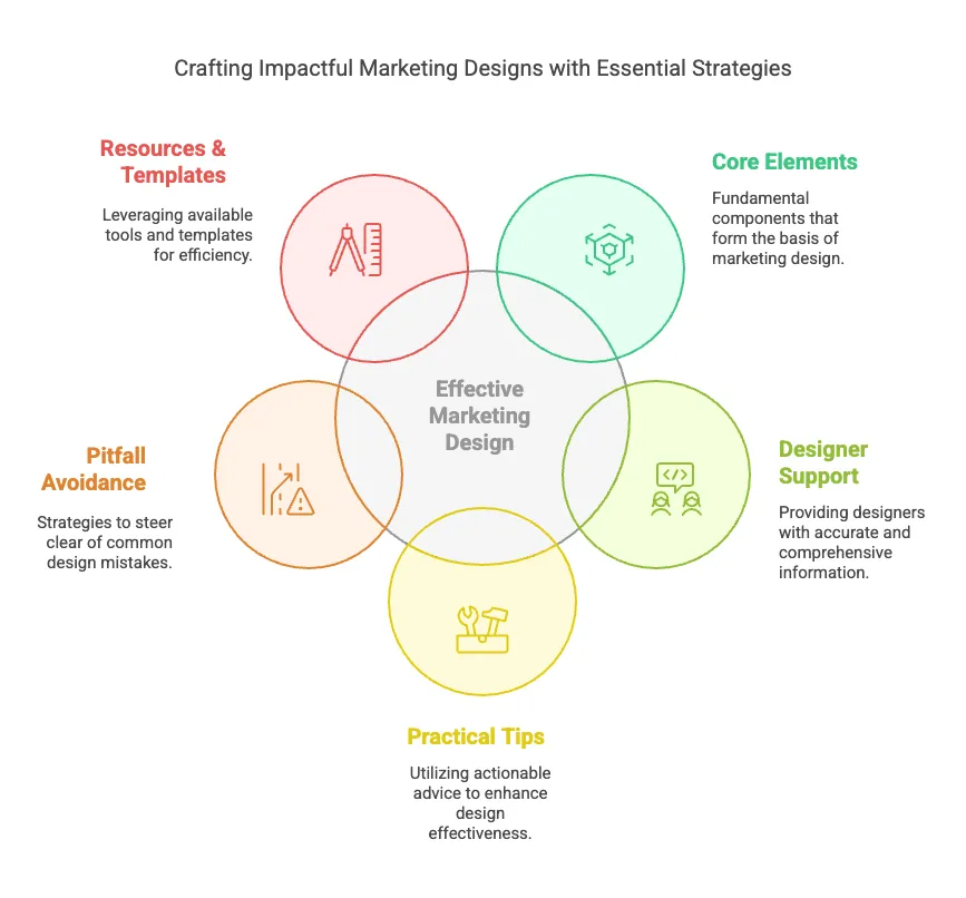
Core Elements of Effective Marketing Design
This section teaches the “must-haves” every time you create a visual.
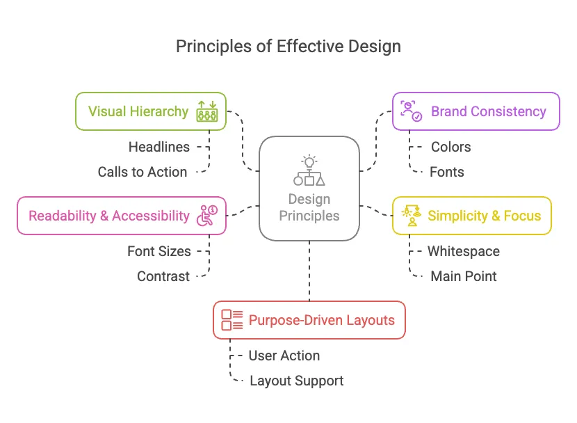
1. Clear Visual Hierarchy
Design should guide the eye. Headlines, subheadlines, and calls to action need to stand out clearly and lead the viewer through the content. Ask: What should people notice first, second, and last?
2. Brand Consistency
Colors, fonts, logos, tone—these create trust and recognition. Stick to the style guide. When visuals feel disconnected, trust erodes
3. Simplicity & Focus
Too many fonts, colors, or competing elements overwhelm users. Make one main point per design. Keep it clean, with generous whitespace.
4. Readability & Accessibility
Choose legible font sizes, good contrast, and alt-text for images. Design should be inclusive—not just pretty.
5. Purpose-Driven Layouts
Designs should be built with intention. What action do you want the user to take? How does this layout support that?
The Role of Design in Marketing Strategy
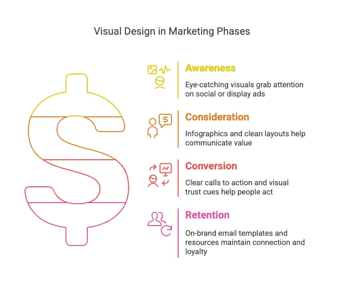
Design doesn’t happen in isolation. It supports the full marketing funnel.
Awareness:
Eye-catching visuals grab attention on social or display ads.
Consideration:
Infographics and clean layouts help communicate value.
Conversion:
Clear calls to action and visual trust cues (like consistent branding) help people feel confident enough to act.
Retention:
On-brand email templates and resources maintain connection and loyalty.
Practical Design Tips for Marketers
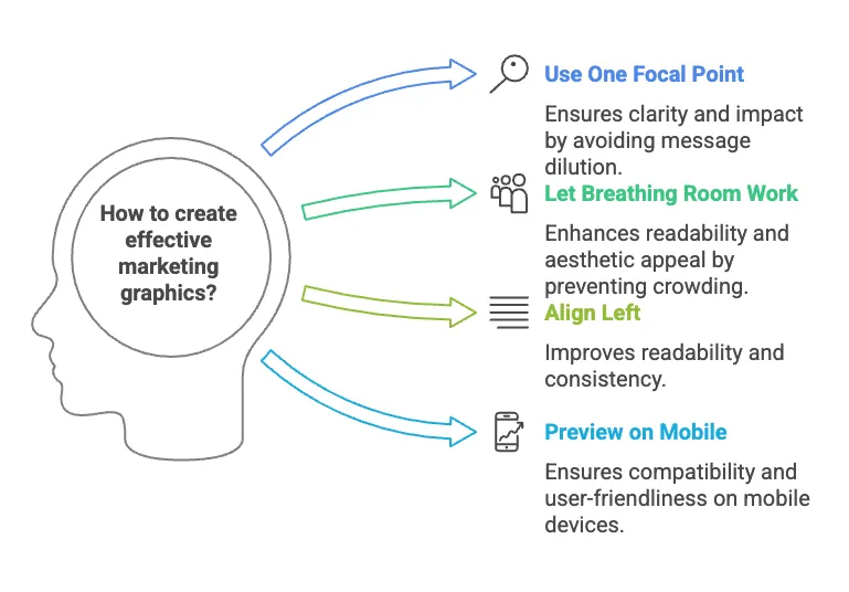
Use one focal point per graphic.
Too many messages dilute impact.
Let breathing room do the work.
Don’t crowd your content.
When in doubt, align left.
It’s easier to read.
Preview on mobile.
Most users will see it there first.
Don’t reinvent—use templates.
Start with the system. Customize only when it serves the message.
Common Pitfalls to Avoid
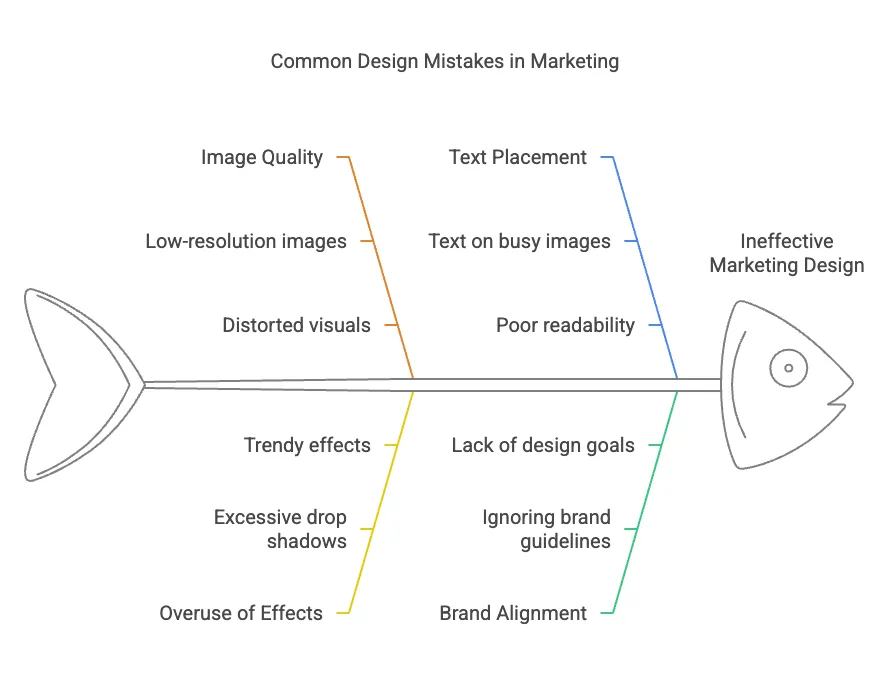
• Using low-resolution or distorted images
• Overusing drop shadows, gradients, or trendy effects
• Adding text directly over a busy image
• Ignoring brand guidelines
• Designing without understanding the goal
Resources for Better Design
Want to level up your design skills or get better at giving feedback? Here are a few places to start:
Brand & Templates:
• Canva's Brand Kit Setup – Learn how to build and maintain visual consistency across your marketing materials.
• Figma's Getting Started Guide – Ideal for teams using design systems and collaborating cross-functionally.
• Google Fonts – Explore web-safe, accessible fonts for marketing use.
Design Fundamentals:
• Visme: Visual Hierarchy Explained – Great intro to layout strategy.
• Adobe: Basic Principles of Design – Covers alignment, contrast, balance, and proximity.
• UX Collective: The Importance of White Space in Design – Why spacing matters and how it improves comprehension.
Giving and Receiving Feedback:
• Figma’s Guide: How to Give Better Design Feedback – Smart tips for team collaboration.
• InVision’s Guide to Design Collaboration – For improving communication between marketers and designers.
Mobile-First & Accessibility
• Material Design Guidelines – Google's framework for mobile-first, accessible design.
• WAVE Web Accessibility Tool – A simple way to test if your designs are accessible.
Final Note
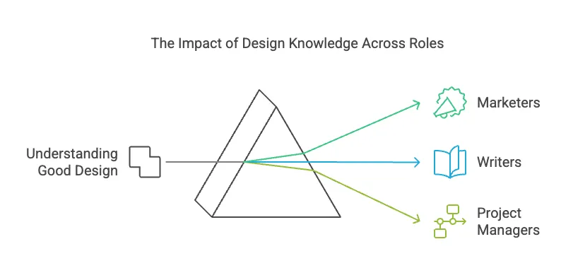
Good design isn't just for designers. Marketers, writers, and project managers all benefit from knowing what makes visual content work. When we all speak the same visual language, the work gets better—and more effective.
Want to know more? Let's Talk!
I’d love to meet you, hear about what you’re working on, and see how I can help support you.

Facebook
LinkedIn